Exclusive shop experience

Ecommerce microsite, C2C
Overview

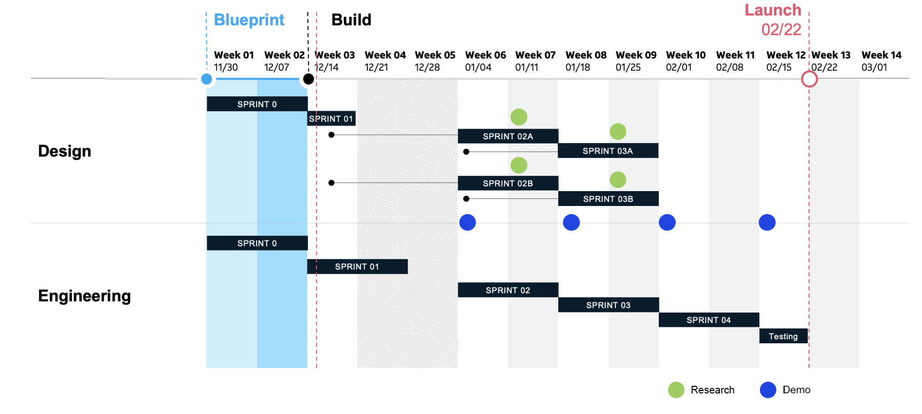
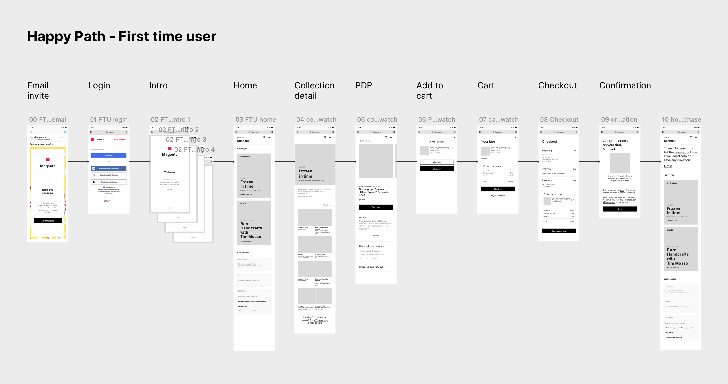
Our client who runs a large e-commerce marketplace, wanted to explore growth opportunities within their online market. We identified an opportunity to drive customer loyalty among the top buyers of select categories that attract niche markets & collectors. In 7 months, we launched a loyalty program microsite.

ROLE
UI/UX design
Usability testing
DATE
‍Dec '20 - Feb '21
Feature image with snippets from the Top Star app
An opportunity to build customer loyalty among top buyers

Top buyers, also referred to as VIPs, are buyers with high spendings in categories such as sneakers, luxury watches, and trading cards. Insights showed that these VIPs are not loyal to our platform and would typically browse competitor platforms for the best deal.

Research showed that VIPs,

  • Want to feel valued for their business through special treatment and benefits
  • Enjoy transacting with people who have domain knowledge
  • Want a hassle-free experience to ensure the authenticity of the item

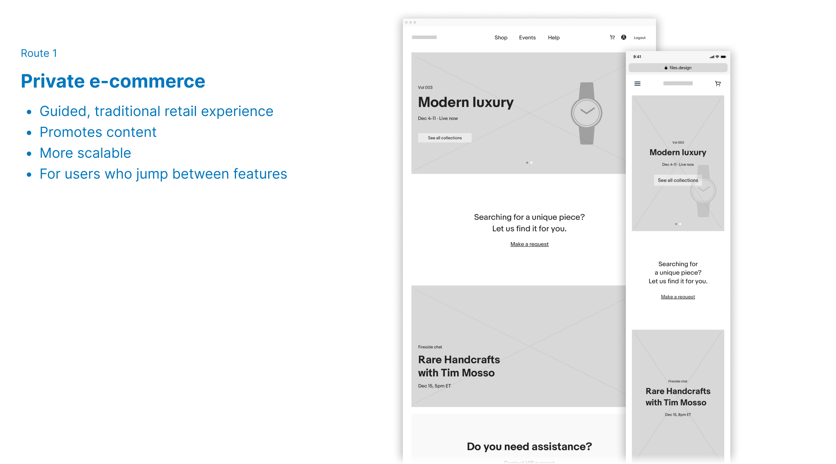
With the rise of competitors that specialize in niche products and resale markets, we aimed to stay relevant by,

  • Building buzz and credibility as a contender in the culture
  • Increasing purchases from habitual buyers due to better findability
  • Improving customer satisfaction
We addressed project constraints to start

We navigated several challenges that shaped our ways of working early on -

  • πŸ“ No access to existing VIP customers for usability research
  • 🧩 Brand identity being developed in tandem
  • 🌏 Coordinating across multiple time zones
  • ⏳ Initial launch goal of 3 months

‍

Workplan (Planned)
Screenshot of original workplan with four sprints
We quickly expanded the design team to tackle the work in stacked sprints
We launched a loyalty program in 7 months
Web and mobile mockups of the Top Star home page

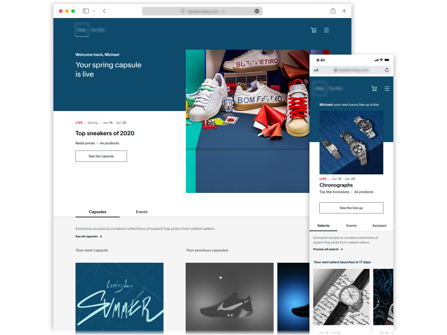
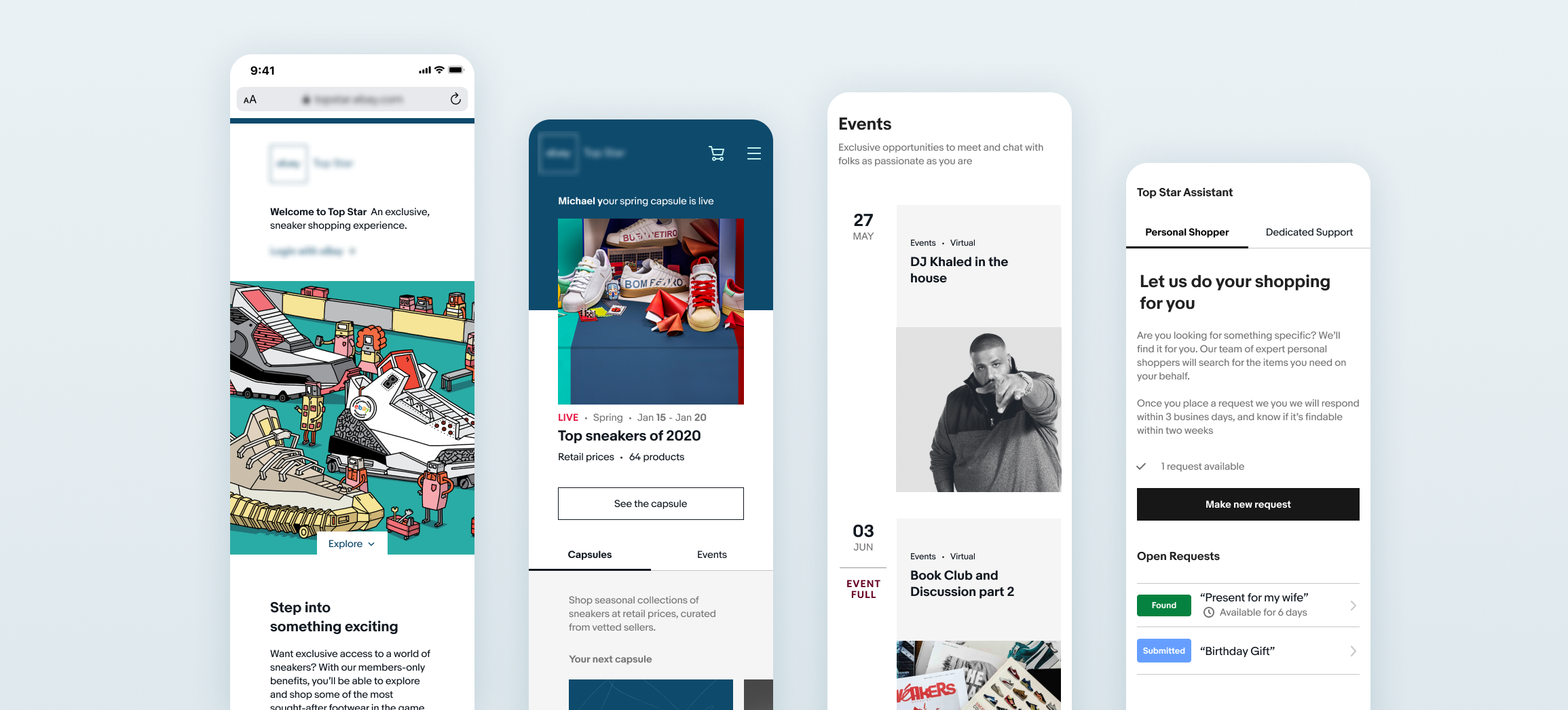
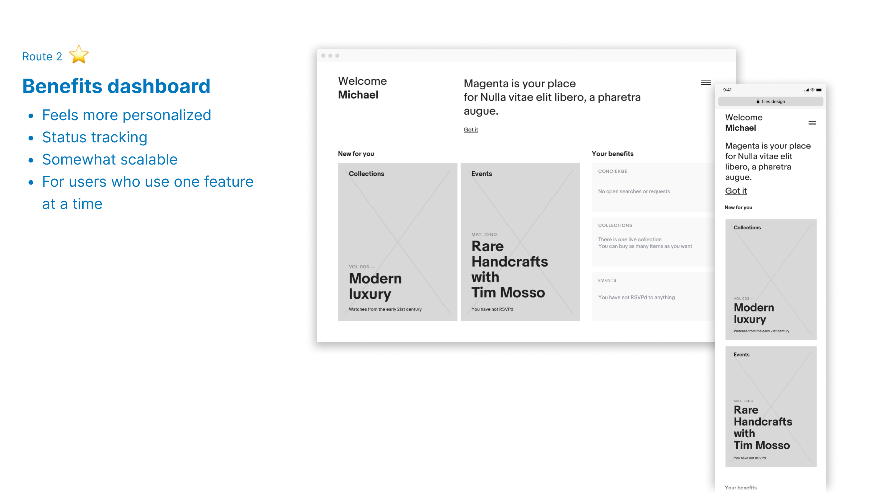
Top Star is an invite-only loyalty program for VIPs to access exclusive deals and benefits. We launched MVP for sneakers and luxury watches, with other categories to follow.

Loyalty benefits:

  • Time-limited deals from vetted sellers
  • Exquisite events to deepen interest
  • Personal shopper for item requests
Blueprint phase
Exploring what 'exclusive' looks like

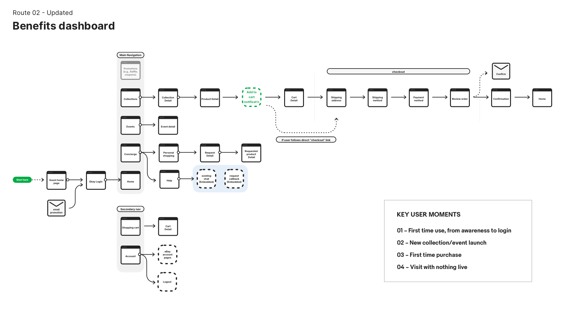
With less than a sprint to align on the vision, we had to put pen to paper fast. Based on the handful of features that were known, the design team presented two different approaches. Guided by the two wireframes, the team aligned on the envisioned goal and path forward.

Concept sketch of second approach, private e-commerce
Concept sketch of first approach, benefits dashboard
Blueprinting the MVP vision

The site map and flow chart helped to visualize the MVP scope, raising discussions like where we might leverage content from the existing website in order to make the fast-approaching deadline.

Design Phase

Designing for a limited offer
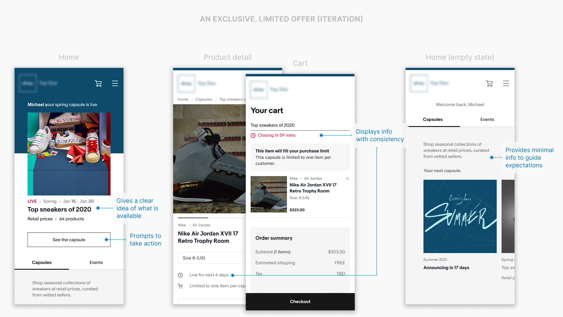
How might we present offerings that feel exclusive?

Business requirements:

  • Curated set of products are available for a limited time
  • Buyers have a purchase limit for each set
  • There are periods when no products are actively available (empty state)
The scarcity principle

To create a cohesive experience around the limited offerings, we focused on presentation and copywriting to give an elevated feel. For triggering scarcity, we had initially thought that a persisting countdown could be effective, but an informational approach was more helpful and clear to buyers.

Testing showed:

  • Users recognize 'Collection' as a curation but need more context to understand that they can shop the items
  • Sneaker users are familiar with purchase limits and time-bound rules from competitor sites
  • If the empty state previews a theme that grabs their interest, users are willing to come back if they receive a reminder when it is live
Early designs focusing on an exclusive and limited offerLater designs focusing on an exclusive and limited offer
Adjust to user behavior

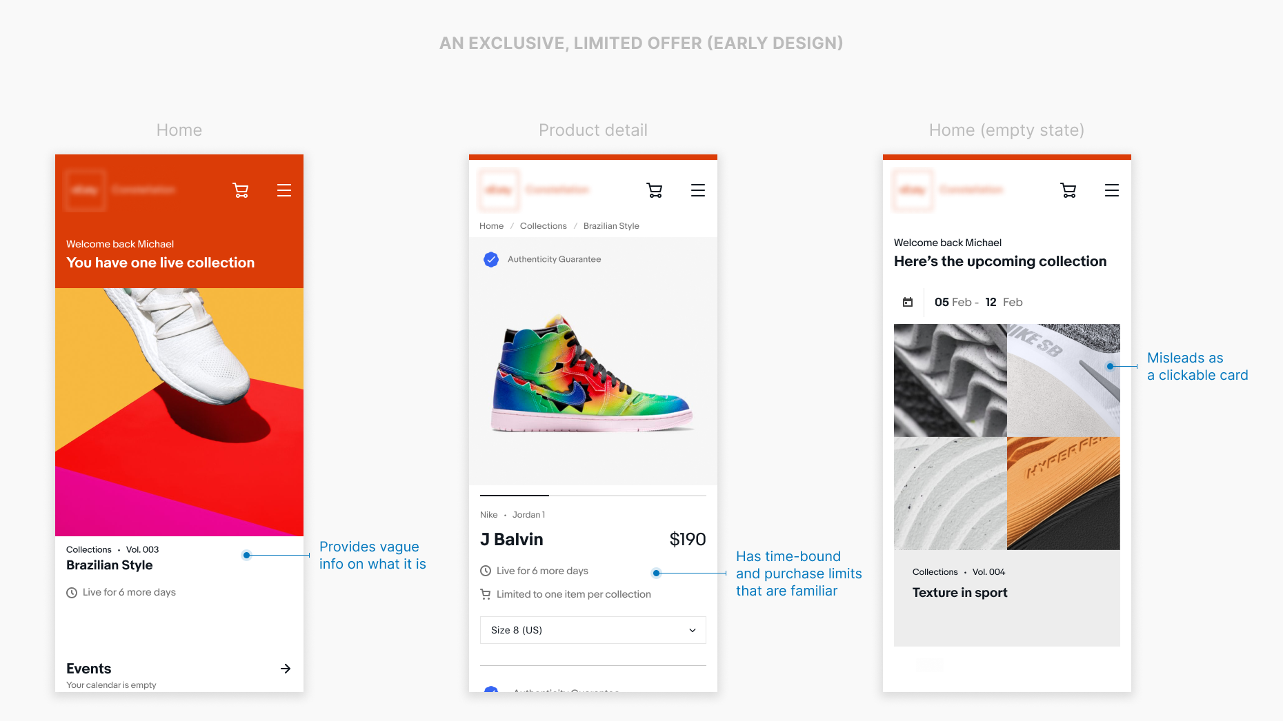
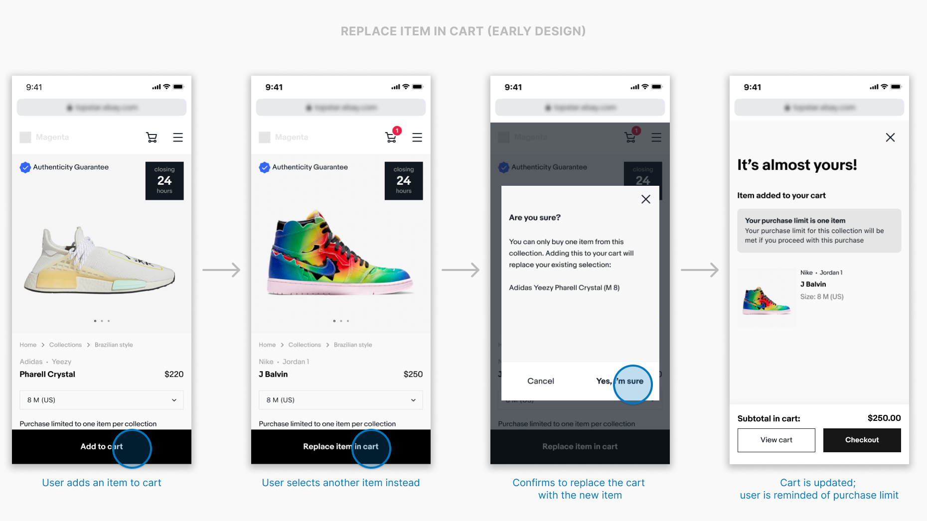
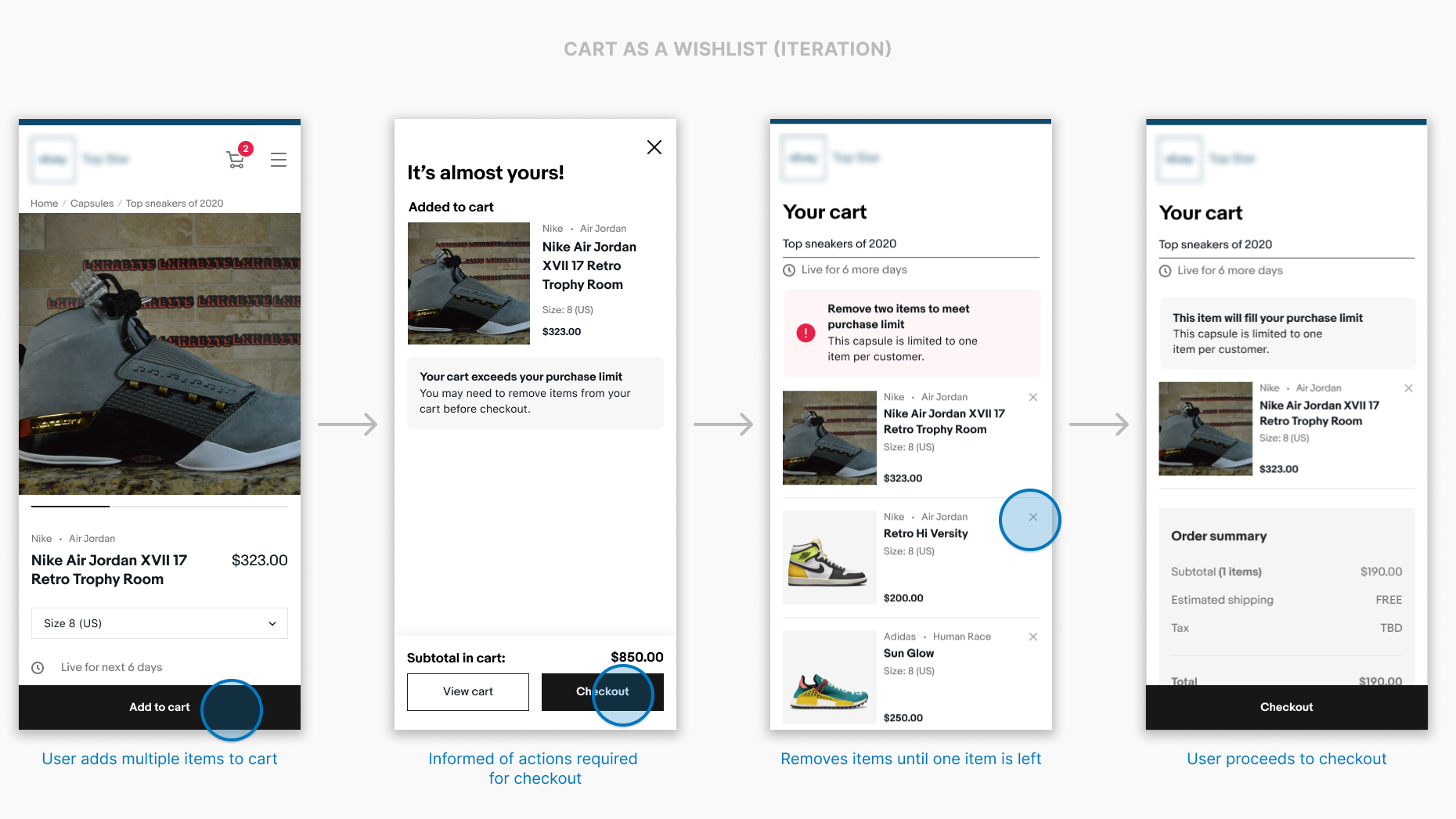
For sneakers, buyers were limited to purchasing one item from a given collection. We initially designed this by limiting the cart and forcing buyers to replace the item in cart as they selected a new item. However, we found that users treated the cart as a wishlist and would fill their cart with many items before narrowing down on their final selection.

Early designs focusing on replacing an item in cartLater designs focusing on using the cart as a wishlist
Gaining trust
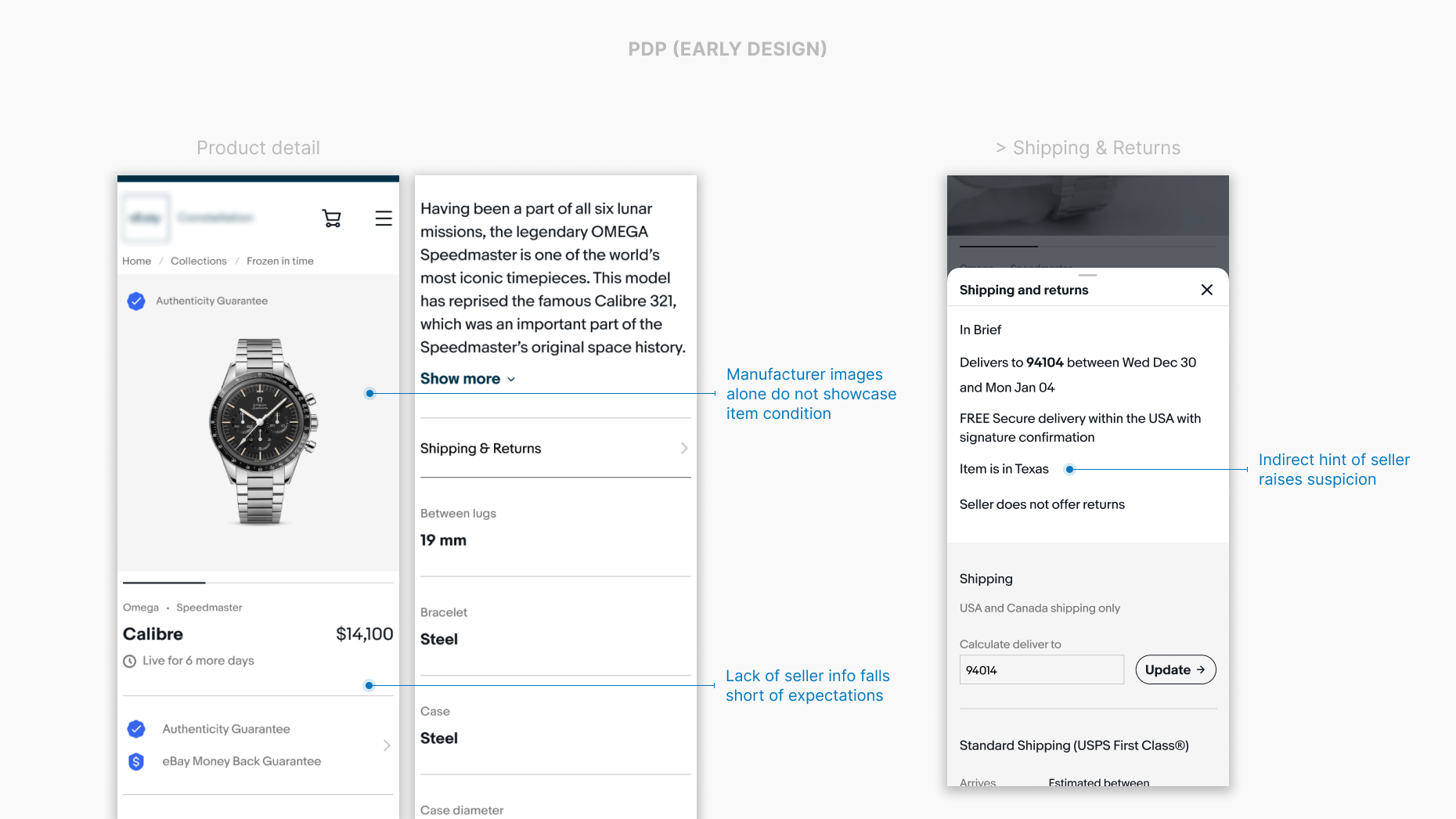
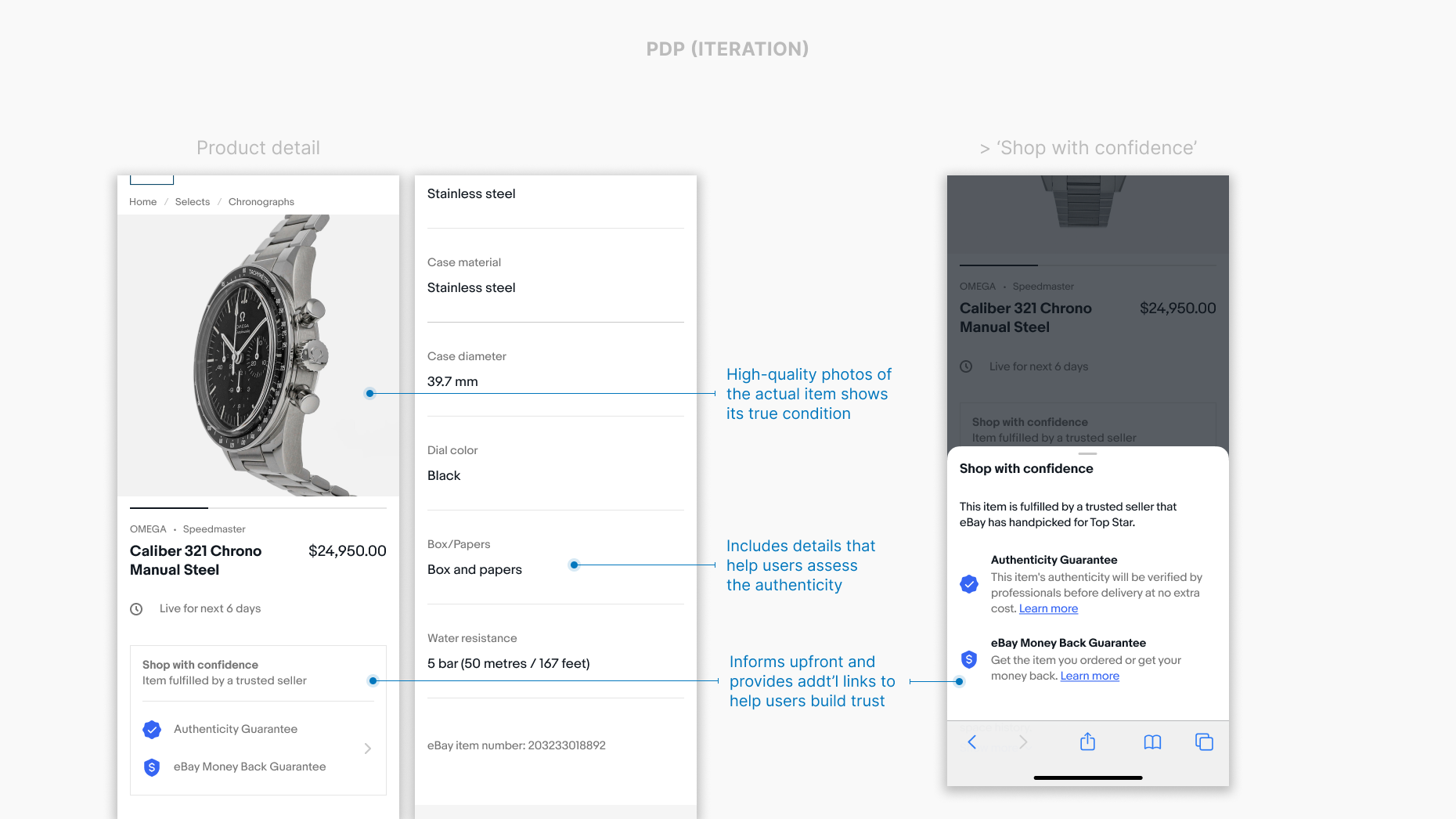
How might we gain trust from buyers who are wary of fakes?
Business requirements:
  • No mention of seller
  • Display the "Authenticity Guarantee" badge
Create transparency

In earlier designs where product details did not reference a seller, many users raised concerns over not seeing ratings or having a direct contact. In iterations, however, where we added a description stating that vetted sellers were handpicked for the program, users recognized the choice as intentional and were more likely to build trust.

Testing showed:

  • Most users expect to see the seller ratings before proceeding to purchase because that's how they transact on the main platform
  • All users look carefully at the listing's details to assess the authenticity
  • Many users would look to others' experiences on the program before they make a purchase
Early designs of the product detail pageLater designs of the product detail page
Outcome

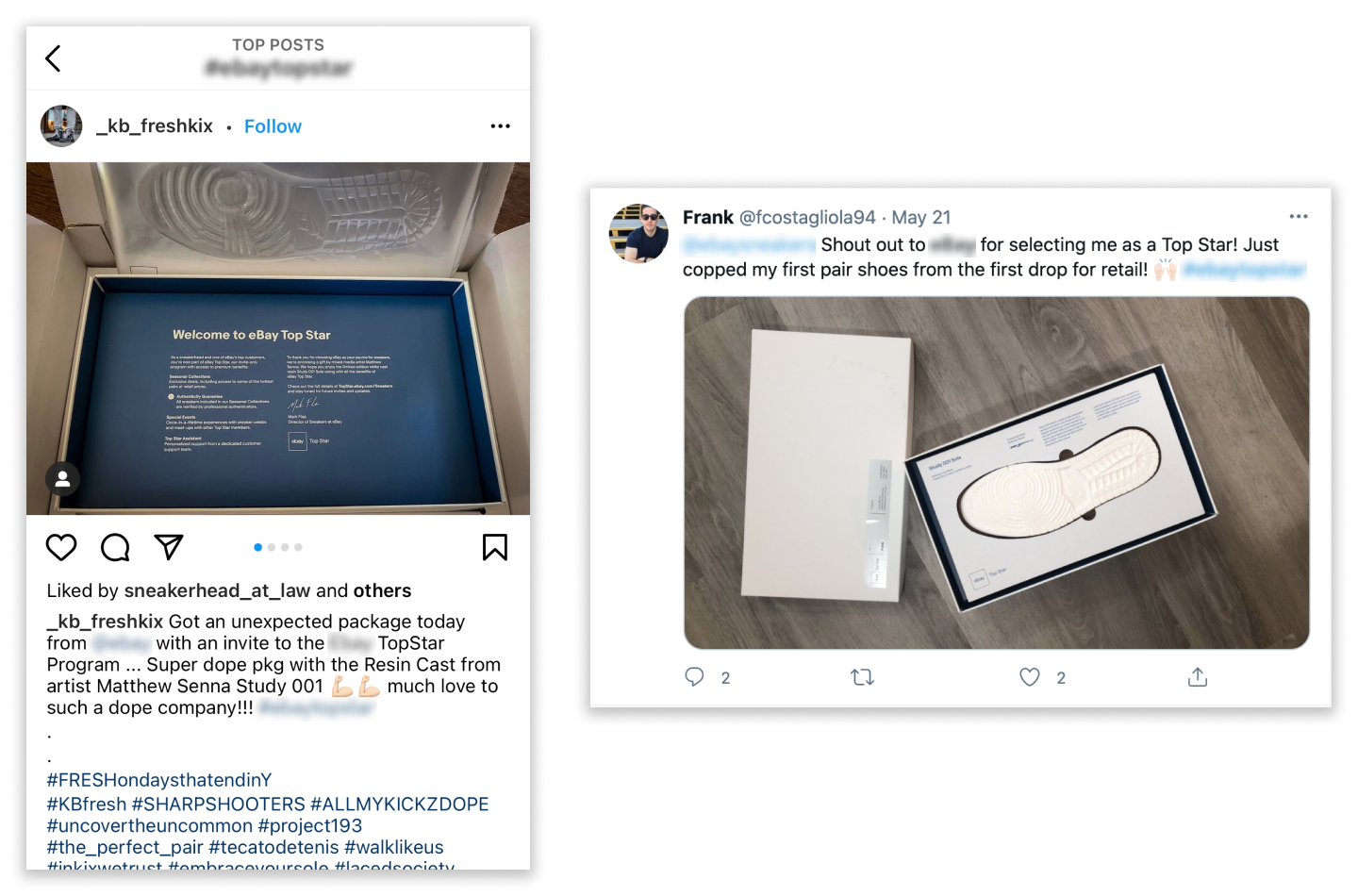
Top Star officially launched in May 2021 (+4 months from initial goal)

Screen captures of social media posts from Top Star users
VIP members received a surprise gift along with their invitation to the program
Learnings
  • Established a collaborative way to design by adopting a new tool and defining structures early on to ease onboarding new designers
  • Built a design system to achieve consistency across designs
  • Managed stakeholder communications with external agencies and client members outside of the project

What I’d do differently if time allowed -

  • Further test for trust. Will users drop off if there is no seller name? What is the minimal amount of information needed for buyers to keep their trust?
  • Enhance offline collaboration. Navigating time differences made communicating with developers a challenge. I would seek out opportunities to further establish working methods between design and dev team.