I led the end-to-end redesign of Rite Aid's mobile pharmacy app for 500,000 users, streamlining the prescription refill flow from 7 taps to 3 and validating a 93% task completion rate through iterative user testing.
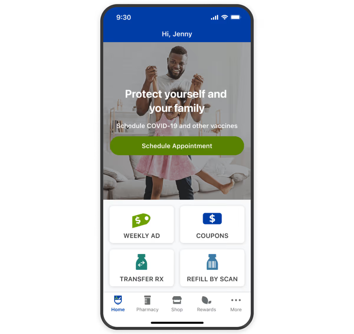
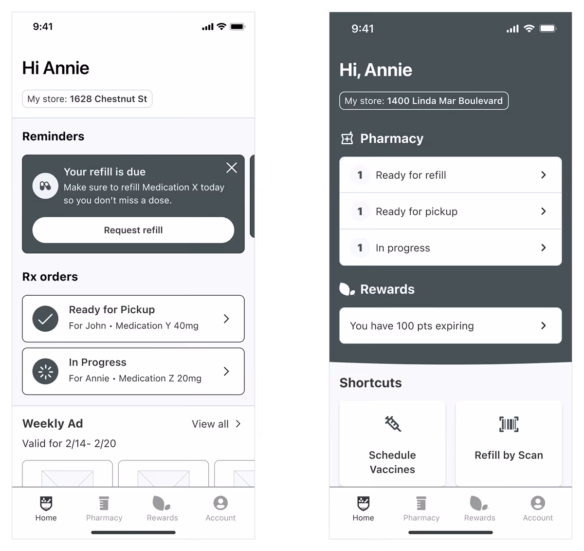
Rite Aid's mobile app had 500,000 monthly active users contributing to 28% of all digital prescription refills—yet the experience was fragmented and frustrating. Users had no visibility into prescription status, forcing them to call pharmacies to check if refills were ready. The home screen consisted of few static navigation tiles and banner with no personalized or action-oriented content, and the app was being stripped of its native shopping functionality, requiring a fundamental reimagining of its value.
How might we transform the app into a personalized hub that helps users manage prescriptions seamlessly while creating pathways to e-commerce and in-store transactions?
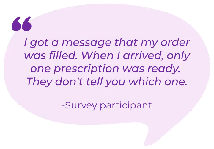
Through surveys and interviews with pharmacy customers, I discovered that prescription status visibility was the critical missing feature—this single pain point drove the majority of negative sentiment. Despite the poor experience, refill-by-scan (barcode scanning) accounted for nearly 90% of app refills, proving users valued convenient prescription management when it worked.
Additionally, I learned that one-third of pharmacy customers manage prescriptions for dependents—meaning some users were juggling 4-10 prescriptions versus the typical 1-2. The design needed to scale gracefully across this complexity range.
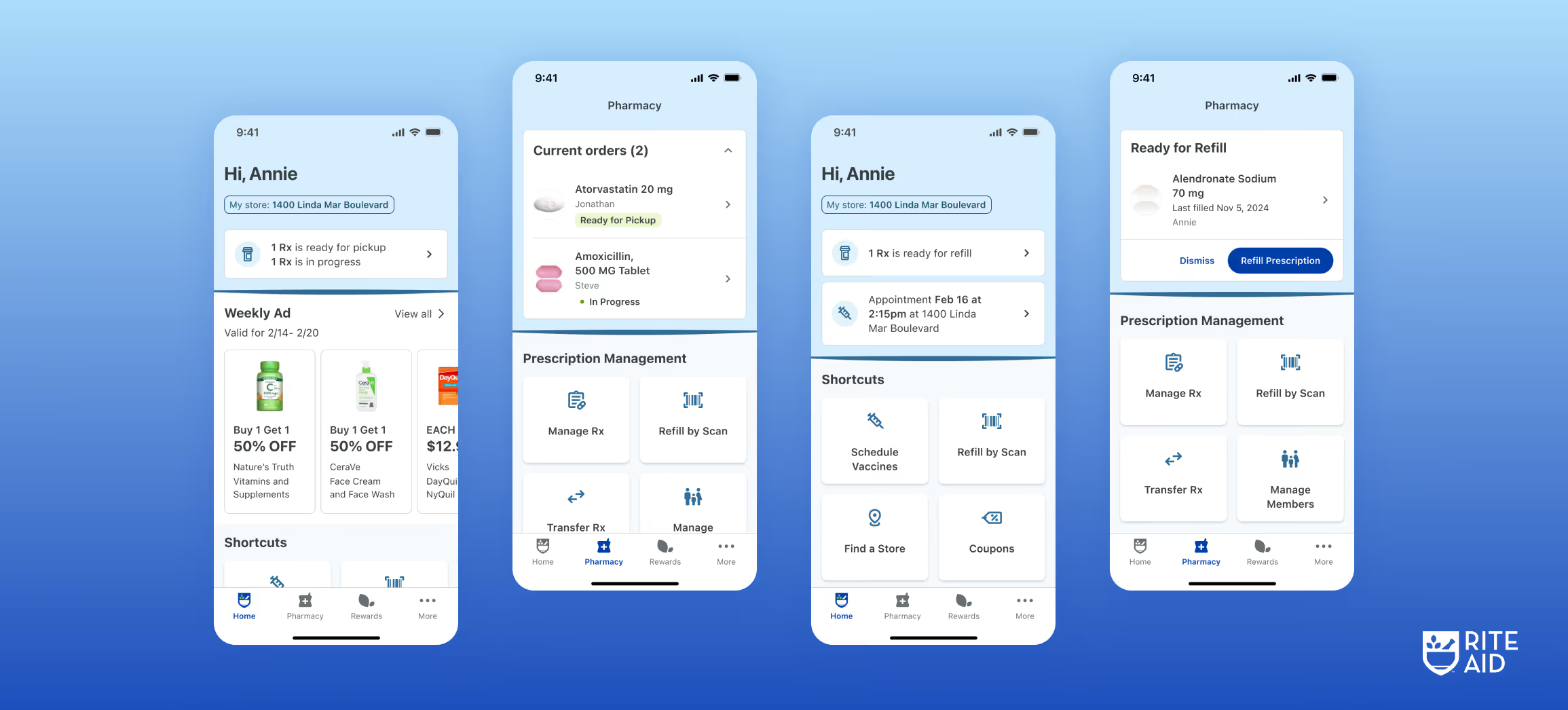
I led the complete redesign from research through implementation, creating a dynamic, card-based home experience that surfaces time-sensitive prescription information and creates natural pathways to commerce.
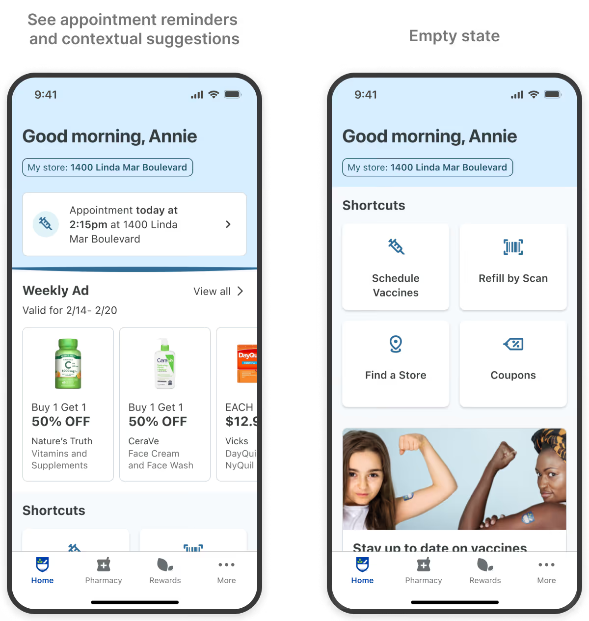
The redesigned home view replaces static promotional tiles with a dynamic, personalized dashboard. Instead of generic navigation buttons, the home now surfaces contextual tools and content—like showing the weekly ad when a prescription is ready for pickup, creating a natural bridge to in-store shopping.
Users can now track their prescription order status directly in the app, eliminating the need to call the pharmacy. The status updates in real-time as prescriptions move through the workflow—from "in progress" to "ready for pickup."

The refill flow was reduced from 6 taps to just 3 taps. Refill-ready prescriptions surface directly on the home screen with one-tap access. For users managing multiple prescriptions, refill-ready medications are automatically pre-selected, allowing them to request all refills together in a single action.


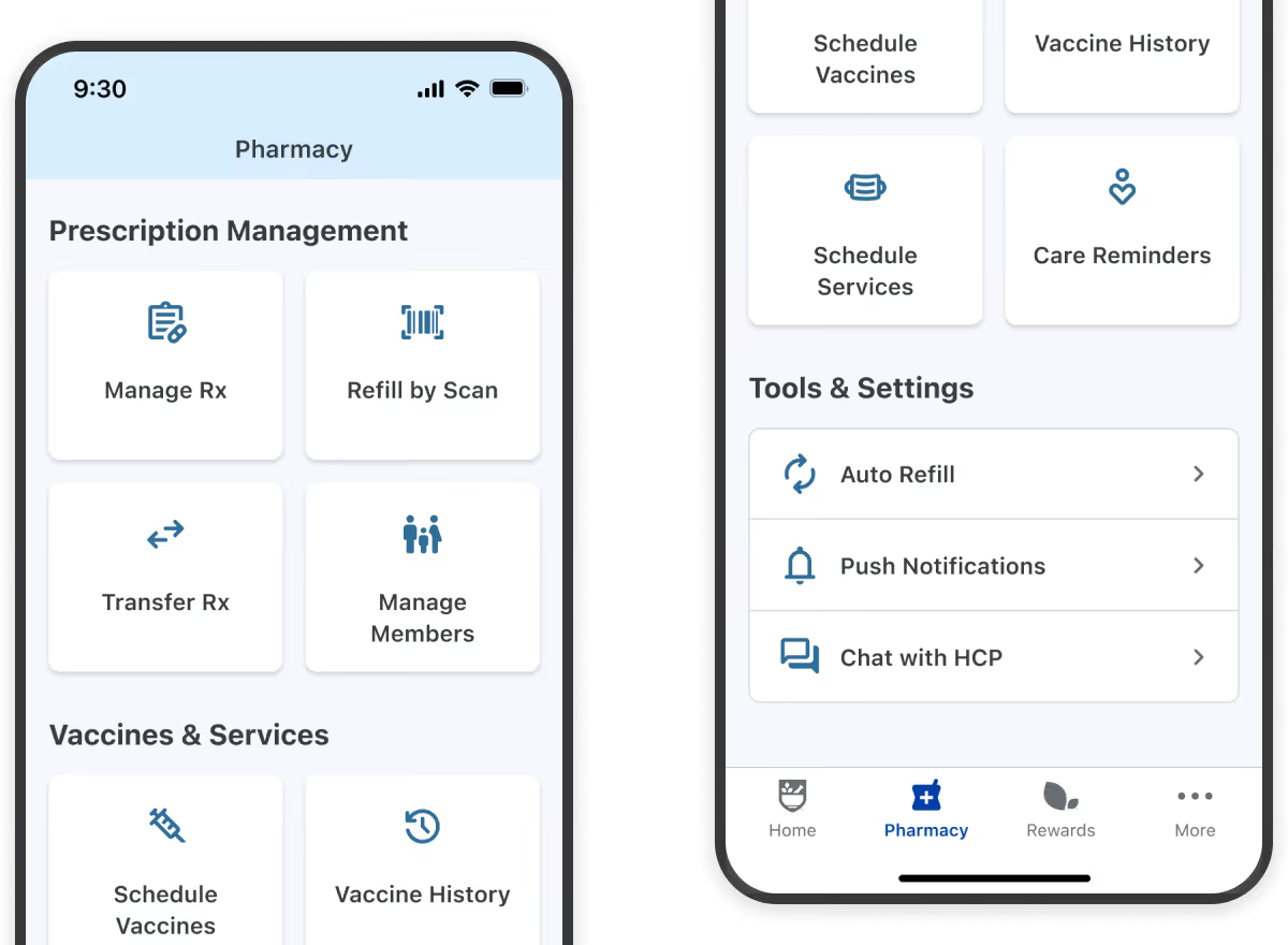
The original pharmacy view was a flat list of six navigation buttons with no hierarchy. The redesign surfaced all 11 pharmacy tools and services, organizing them into three clear categories: "Prescription Management," "Vaccines & Services," and "Tools & Settings"—prioritized by usage frequency.
Through unmoderated usability tests with 15 participants, I discovered users were skimming past critical information. I simplified cards to highlight actionable information only and limited the home view to "must-have" content: Rx status, appointments, and e-commerce orders.
I also tested two approaches for refill reminders—dismissible cards vs. persistent status indicators. The status approach won, as users left it visible as a passive reminder rather than dismissing and forgetting.
The redesign received strong validation through testing and stakeholder approval:
While the redesign didn't launch due to Rite Aid's bankruptcy in May 2025, the project demonstrates my ability to lead complex healthcare UX initiatives end-to-end and make strategic design decisions under significant constraints.
This project taught me to advocate for mobile-specific optimizations even when stakeholders push for web parity. By building consensus through regular reviews and presenting user testing data, I balanced consistency preferences with evidence-based design decisions—resulting in solutions like the active prescription filter that prioritized performance and usability over strict parity.